@mozze_19
Jual Cat Mobil & Motor
CAT BUNGLON GOBLIN GREEN Cat Bunglon Lovegirl/ Cat Variabel Optik, Cat Warna 3D\ Cat bunglon blueish purple Panca Warna Paint CAT BUNGLON LOVEBIRD / LOVEGIRL Cat Bunglon SunBlood ( bunglon sunblood orange,gold,green ) Cat Moonlight Green PU Original Pabrik Cat Moonlight Black Special Effect Red PU Cargloss Miraton 1600 Cat Honda Motor Original - Matt Max Brown Met ( 200g / 1000ml ) Cargloss Miraton 1600 Cat Honda Motor Original - NH 436 Matt Gun Powder Black Cargloss Miraton 1600 T/C Cat Honda Motor Original - R378 M Matt Solar Red Met cat cargloss miraton Lantern orange Scoopy ( 200g ) cat cargloss miraton new lime green original kawasaki Cargloss Miraton 1600 T/C Cat Honda Motor Original - NH-341 P Pearl Fadeless White Cargloss Miraton 1600 T/C Cat Honda Motor Original - Candy Arowana Red Met cat cargloss miraton Hm Matt ion blue met ( 200g \ 1000g ) Cat Moonlight Black Special Effect Red PU Cat Moonlight Green PU Original Pabrik Cat Moonlight Black Special Effect Red PU cat moonlight red PU penta oto ( 100ml,200ml,400ml,500ml,1L ) Car Cat Moonlight Black Effect Red Penta Oto Custom Cat Moonlight Green Custom PU Penta Oto cat Moonlight red PU penta oto ,kaleng asli pabrik ( 1L ) Car Cat Moonlight Black Special Effect Gold PU Car cat moonlight black special effeck blue PU Car cat moonlight black special effect green PU Car cat moonlight black special effect Purple/violet PU Car Cat Moonlight Blue PU Custom ( 100ml,200ml,400ml,500ml,1L ) Car Cat Moonlight Black Special Effect Pink PU

Thursday, December 31, 2009

Diary of an Interesting Year


Patricia Gray living room by Michelle Morelan

A Rendering of my Living Room given to me as a Christmas gift by Michelle Morelan.

2009 is a great year to reflect back on, now that it is almost over. Whew, what a turbulent year - full of challenges. I am not one to buy into the doom and gloom of the economic climate (I have weathered others through the years: early 80's, early 90's, late 90's), but this year was a year of an down economic climate that has seemed to have escaped no one in the 'world.'  There is a saying that when the going gets tough, the tough get going. It is hard to see when you are in the midst of chaos, until you have come through it.....hopefully we are through it!!! One of the benefits for me was that I kept busy and was continually looking for ways to recharge and re-inspire. I was fortunate to have four wonderful trips this year to do just that. It is very important when you are working in a creative field to be continually evolving and expanding your horizons, and travel helps me to do that. I also full filled a life long dream this year and went back to school and took two Art classes in Mixed Media Painting. I subsequently turned my garage into an Art Studio and have spent many glorious days there immersed in painting.

A trip to Palm Springs in the early Spring - where I became fascinated with and wrote a Blog posting on the Mid-Century Post Modern resurgence of 'screen block.'

Palm Springs Modern Architecture and the Use of Screen Block

A trip to the Okanagan with my Dad and a visit to the The Nk'Mip Winery and Resort in Osoyoss where I was inspired by the use of Rammed Earth in Modern Architecture.

 Rammed Earth Wall NK'MIP Winery Osoyoos
Rammed Earth Wall NK'MIP Winery Osoyoos

A trip to New York in September and another in December.  What can I say about New York, other than that it is one of the most exciting and visually stimulating cities in the world.  Being able to see the artwork of great masters at the MOMA, Georgia O'Keeffe at The Whitney, and Kandinsky at the Guggenheim - it just doesn't get better than that. I shopped for clients at the D & D Building, A & D Building, and the New York Design Center, explored Soho, Tribeca, the Meat Packing District, Canal Street, walked Central Park, 5th Avenue, tried the Subway, enjoyed live theatre, ate at wonderful restaurants, enjoyed the lights and shop windows all decorated for Christmas, met new friends, and connected with old friends.

image 2009 Dec NYC 008
Kandinsky at the Guggenheim / The Meatpacking district and Highline / South Pacific at The Lincoln Center 


Mixed Media Painting Classes
at Emily Carr University of Art

Frottage 1  24" x 36" Mixed Media: Pastel, Acrylic, Gesso on Glassine

NYC Dec 005 NYC Dec 007
Experimenting with Mono Prints

Emily Carr 065 
Acrylic on Canvas

image
The Salton Sea 23" x 36" Mixed Media on Paper

Sept27 2009
West Coast Landscape 24" x 48" Acrylic & Mixed Media on Canvas  

Emily Carr 012
Triptych in My Living Room: Be Still My Bleeding Heart 72" x 36"'
Chinese Ink on Bronze & Silver Metallic

Emily Carr 006 
Diptych in My Living Room: Koi Pond 16" x 16" Gold & Pearl Opalescence (right)

Emily Carr 024 2009 Sept NYC 011
My painting companion - Nicole
image image
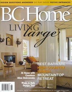
I am very honored to be on the 'Board of Experts' for LoftLife Magazine in 2009, and to have an article published in BC Home Magazine

I wish you all a very Happy, Healthy, and Prosperous 2010 and may all your dreams come true!!

Patricia Gray is an award winning Interior Designer in Vancouver, Canada who blogs about WHAT'S HOT  in the world of Interior Design.
2010 © Patricia Gray | Interior Design Blog™

Tuesday, December 29, 2009

Wrapping up 2009

I always revel in the week between Christmas and New Year as a time diverge from routine, and welcome the New Year in with a change in what I usually read throughout the year, which are books on Interior Design. One of the ways I make a choices on what I want to read, is to leaf through several books and read the jacket covers or page through the book randomly to see if anything speaks to me. That is how I choose, What the Dog Saw by Malcolm Gladwell. I had previously read his book, Tipping Point, and then saw him interviewed on a talk show on his third book - Outliers. While paging through his most current book, What the Dog Saw, I was immediately hooked on his article entitled: The Ketchup Conundrum. This book, What the Dog Saw, contains Malcolm Gladwell's favourite pieces that he has written over the last several years for the pages of The New Yorker. "Good writing," Gladwell says in his preface, "does not succeed or fail on the strength of its ability to persuade. It succeeds or fails on the strength of its ability to engage you, to make you think, to give you a glimpse into someone else's head."  It is a fascinating read.

image  image  image

Another favourite way to choose a book is to ask people what is their favorite book they have read. Usually they are so enthusiastic in recounting the highlights of the book that it gets me excited to read it. The outcome of my most recent enquiry was - the New York Times Bestseller by Muriel Barbery, The Elegance of the Hedgehog. This book is set in Paris, which immediately attracted me, but the real focus of the book is about a woman who is a concierge at a bourgeois building in a posh Parisian neighborhood. She (Renee) has a secret: she is a ferocious autodidact who furtively devours art, philosophy, music, and Japanese culture. Renee hides her true talents and her finest qualities from a world that she suspects cannot or will not appreciate them. It is a story about living out her life in obscurity to hide this fact about herself, and how she reconciles herself to owning her brilliance. 

Last night on Charlie Rose I watched a fascinating interview with the brilliant Orhan Pamuk, a Turkish novelist and winner of 2006 The Nobel Prize in Literature, on his new book: The Museum of Innocence. The story, which takes place in Istanbul between 1975 and today, is about obsessive passion and the great question: What is love, really?, as well as a look into the minds and culture of the Turkish society. I am off to purchase this book tomorrow to wrap up my reading for these last few day left of 2009.

What is your favourite book that you have read lately?
Please leave a comment here, and let me know.

Patricia Gray is an award winning Interior Designer in Vancouver, British Columbia, Canada who blogs about "WHAT'S HOT"
in the world of Interior Design: New and Emerging Trends, Contemporary Design, Modern Architecture and Travel,
as well as how your surroundings can enhance the world around you.
© Patricia Gray | Interior Design Blog™ 2009

Thursday, December 24, 2009

Christmas Greeting


image 

I got this from a friend, and I thought it might also get you in the Christmas Spirit...... Enjoy the spirit of Christmas, wherever you may be, and whoever you may be with!!! Patricia

P.S. And I add greetings to all the "beautiful men of this world."

Friday, December 18, 2009

Christmas in New York City - Art Galleries & Theatre

Christmas in New York City - Galleries & Theatre

This Christmas visit to New York I was fortunate to see the Musical, South Pacific at the Lincoln Center, and two Art Galleries; Georgia O'Keeffe at The Whitney Museum of Modern Art and Kandinsky at the Guggenheim Museum. I love theatre in New York.  There is something very special about getting dressed up and the excitement of the opening strains from the Orchestra.It was a toss up between the new play 'A Little Night Music', the latest revival of Stephen Sondheim's Tony Award-winning musical with Angela Lansbury and  Catherine Zeta-Jones, or the classic Rodgers and Hammerstein musical 'South Pacific' at the Lincoln Center. I am happy to say that I saw South Pacific and it was as good as the concierge at my Hotel said it was. There was something soothing about hearing songs that I have grown up with and are so familiar. The theme song "Some Enchanted Evening," stayed with me for several days. Here is the YouTube version of 'Some Enchanted Evening' you can listen to.

 2009 Dec NYC 0082009 Dec NYC 009

  
South Pacific at Lincoln Center 

The Guggenheim Museum had a wonderful exhibit of the work of the Russian artist, Vasily Kandinsky, who was a pioneer of Abstract Art and broke new ground in painting in the first decades of the twentieth century. The Guggenheim designed by Frank Lloyd Wright was opened in 1959 and, rightly so, is claimed to be one of his most famous masterpieces. The spiraling design of the interior makes this museum one of the best venue's I have ever been in to view an art exhibit. As you walk up the spiral ramps you can view the pieces of artwork as a whole. Magnificent!!!

NYC Dec 164

image NYC Dec 178 

 NYC Dec 176 2009 Dec NYC Michelle 028  

NYC Dec 184
The view from the roof top of the Guggenheim across the reservoir & jogging trail of Central Park.

 NYC Dec 190 
I want this townhouse!

NYC Dec 192 2009 Dec NYC Michelle 029

image image
These are two of my favourite pieces by Kandinsky from the exhibit. 
You can view the exhibit on line here.

After the exhibit we got directions to a local's favourite restaurant on E. 73rd Street where I had a most memorable lunch of Arugula salad topped with sliced roasted artichokes and topped off with large, (very large) paper fine slices of Parmigiano-Reggiano.  Yummm!!

NYC Dec 026 NYC Dec 025
Via Quadronno on E. 73rd Street. (left)
A Beautiful piece of street sculpture outside the restaurant. (right)

The walk back to the Hotel was in typical New York style down streets lined with beautiful townhouses all decorated for the holiday season, past apartments with uniformed concierges, among the locals walking their dogs, across streets with bumper to bumper honking taxis, and a short jaunt through Central Park.

NYC Dec 240

 NYC Dec 242 NYC Dec 248 
Townhouses decorated for Christmas on E 73rd Street

 NYC Dec 203 NYC Dec 263 
Fifth Avenue

I wanna wish you a Merry Christmas
From the bottom of my heart.

Feliz Navidad
Feliz Navidad
Feliz Navidad
Prospero Ano y Felicidad.

Feliz Navidad
Feliz Navidad
Feliz Navidad
Prospero Ano y Felicidad.

I wanna wish you a Merry Christmas

From the bottom of my heart.

Patricia Gray Inc is an award winning Interior Designer firm  in Vancouver, Canada who blogs about WHAT'S HOT  in the world of Interior Design.
2010 © Patricia Gray | Interior Design Blog™

Tuesday, December 1, 2009

2010 Color Trends

Color Experts Farrow & Ball Create 4 Key Color Trends for 2010 

I just received the run down on the 2010 color trends from Farrow & Ball. They are all fresh and exciting combinations. I like the earthy shades in the Industrial color trends palette.  The subtle, natural colors in the Aquatic color trends palette would be dreamy in a bedroom. I especially like the dark and dramatic colors in the Urban Decay color trends palette (Pitch Black No.256 is one of my all time favourite accent colors). And how can you top the Glitz & Glamour color trends palette for adding a bit of pizzazz to a room. I would stick with the neutrals for the largest areas (Cat's Paw No.240, Savage Ground No.213,Ringwold Ground No.208) and use the brighter accent colors sparingly, maybe incorporating them in artwork and accessories.

1. Industrial 2010 Color Trends: A strong but fragile fusion of colour.

Inspired by industrial architecture, this look is all about modernity mixed with tradition. Old and new are combined in an urban palette of muted tones that mimic the earthy shades of natural materials such as stone, clay, chalk and brick. Team soft grey based neutrals such as Cornforth White No.228 and Pavilion Gray No.242 with intense and inky darks such as Off-Black No.57 and Down Pipe No.26 to create a contemporary scheme. The deep, dramatic hues are accented and uplifted by splashes of vibrant, zestful colour with citrus shades such as Babouche No.223 or Orangery No.70.

2010 Color Trends

2010 Color Trends
Key colours for the Farrow & Ball Industrial 2010 Color Trends :
Farrow & Ball Down Pipe No.26
Farrow & Ball Off-Black No.57
Farrow & Ball Pavilion Gray No.242
Farrow & Ball Cornforth White No.228
Farrow & Ball Setting Plaster No.231
Farrow & Ball Orangery No.70
Farrow & Ball Babouche No.223
Farrow & Ball Blackened No.2011

2. Aquatic 2010 Color Trends: A soft, watery palette defined by the elements.

This is a gentle, tranquil scheme. Subtle, natural colours are starkly contrasted with strong inky blues and combined with the reflective qualities of light, glass and mirrors for a diluted, watery look featuring freshwater tones. Try Strong White No.2001 or James White No.2010 teamed with the soft Pavilion Blue No.252 or Tunsgate Green No.250, and underpinned by Blue Ground No.210, Drawing Room Blue No.253 or Hague Blue No.30.

2010 Color Trends 
2010 Color Trends
Key colours for the Farrow & Ball Aquatic 2010 Color Trends:
Farrow & Ball Pavilion Blue No.252
Farrow & Ball Tunsgate Green No.250
Farrow & Ball Blue Ground No.210

Farrow & Ball James White No.2010
Farrow & Ball Hague Blue No.30
Farrow & Ball Strong White No.2001
Farrow & Ball Drawing Room Blue No.253

3. Urban Decay 2010 Color Trends: A vibrant scheme with an unpredictable twist.

Bold and graphic, this look is heavily influenced by the global economic meltdown and features the strong use of vibrant colours, but with an urban edge. Team dark and dramatic colours such as Pelt No.254 and Pitch Black No.256 together in a scheme for a theatrical look and experiment with paint finish as well as colour to make a real statement. Use Eco Full Gloss to create a high shine surface and inject with zingy, bright colours such as Arsenic No.214 and Dayroom Yellow No.233 for added impact and the ultimate visual scheme!

2010 Color Trends
2010 Color Trends
Key colours for the Farrow & Ball Urban Decay 2010 Color Trends :
Farrow & Ball Pelt No.254
Farrow & Ball Pitch Black No.256
Farrow & Ball Oval Room Blue® No.85
Farrow & Ball Parma Gray® No.27
Farrow & Ball Dayroom Yellow No.233
Farrow & Ball Arsenic No.214
Farrow & Ball Great White No.2006

4.  Glitz & Glamour 2010 Color Trends: A decadent look that celebrates excess.

In complete contrast to Urban Decay, this look is all about wealth and indulgence. Use rich and opulent shades like Brinjal No.222, Pitch Blue No.220 and Churlish Green No.251, alongside shimmering gold and metallics for an extravagant feel. This glamorous, glitzy look has a Middle Eastern influence, so colours include exotic shades which combine and collide in a celebration of colour and excess. Try Porphyry Pink No.49, Brinjal No.222 and Churlish Green No.251; a riot of colour with an adventurous twist. Key to this look is the myriad of colours – definitely not for the faint-hearted!

2010 Color Trends
2010 Color Trends
Key colours for the Farrow & Ball Glitz & Glamour 2010 Color Trends :
Farrow & Ball Brinjal No.222
Farrow & Ball Cat's Paw No.240
Farrow & Ball Churlish Green No.251
Farrow & Ball Savage Ground No.213
Farrow & Ball Pitch Blue No.220
Farrow & Ball Porphyry Pink No.49
Farrow & Ball Cinder Rose No.246
Farrow & Ball Ringwold Ground No.208

What is your favourite 2010 Color Trends palette? 
Please let me know by leaving a comment [here].

PATRICIA GRAY INC is an award winning interior design firm writing about lifestyle and
WHAT'S HOT in the world of interior design, architecture, art and travel.
2011 © Patricia Gray | Interior Design Blog™

Friday, November 27, 2009

Knitting 101

This year for Christmas presents I am knitting a few scarves for special gift giving. My Grandmother taught me to knit when I was 5 and I have continued to knit on and off over the years. I love going into yarn shops and feasting my eyes on all the colors and textures available. On my last trip to the yarn shop I was captivated by this most exquisite shade of teal blue. It is a blend of wool mohair and silk, and knits up as soft and light as a spider's web. I love working with bamboo needles. This scarf is super easy. Cast on as many stitches as you need to make the scarf the width you want and then just knit every row until it is long enough. For this season extra long and very narrow scarves seem to be all the trend.

Happy Knitting If you have any knitting projects on the go please leave a comment [here].
PS I am going on a plane trip...does any one know if knitting needles are allowed through security??

Helpful Videos:
Knitting 101 Casting on Stitches
Knitting 101 The Knit Stitch
Knitting 101
Casting off Stitches
Knitting 101
Knitting Tips

Patricia Gray is an award winning Interior Designer in Vancouver, British Columbia, Canada who blogs about
"WHAT'S HOT" in the world of Interior Design: New and Emerging Trends, Contemporary Design, Modern Architecture and Travel,
as well as how your surroundings can enhance the world around you.
© Patricia Gray Interior Design Blog™ 2009

Thursday, November 26, 2009

Interior Design 101

Patricia Gray in BC Home Magazine 
Talks about Design 101

AA Front Cover
BC Home Magazine Design 101

Article p 1

BC Home Magazine Design 101 cont.

image
BC Home Magazine Design 101  

image
View article in Adobe Reader
BC Home Magazine Design 101

PATRICIA GRAY INC is an award winning interior design firm writing about lifestyle and
WHAT'S HOT in the world of interior design, architecture, art and travel.
2011 © Patricia Gray | Interior Design Blog™